

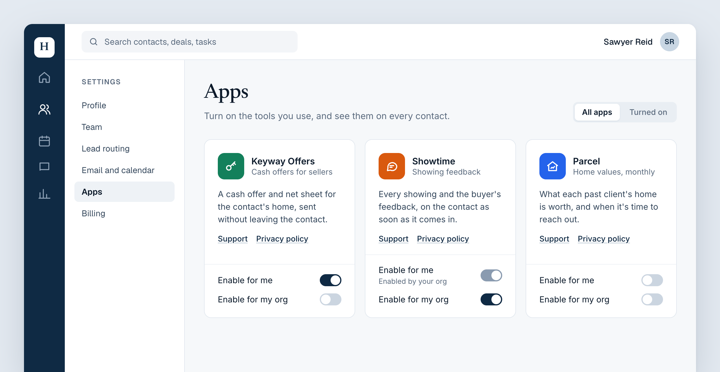
mountEmbeddedAppMarketplace() lists your approved apps as cards, with a switch for each scope the user may turn apps on for.
Mount the marketplace
Put it on a settings or integrations page, with the marketplace token:- Enable for me, when your marketplace allows For themselves.
- Enable for my org, when your marketplace allows For their org and the
token has
embed:enable_organd anembed.org.
Options
Handle methods
Style it to match your product
Unlike the apps, the marketplace renders directly in your page, in a shadow root on an element it adds to your container. It inherits your page’s font and text colour. Tune the rest with these CSS custom properties, set on the container or any ancestor:
For anything else, style its parts with
::part(): apps, empty, card,
icon, name, tagline, description, links, link, toggles,
toggle, toggle-label and note.